Illumina BaseSpace
Updating Illumina's data management and bioinformatics platform to align with the updates to their hardware design language.

ROLE
UX Designer
UX Researcher
TEAM
Christopher Dye - Design Owner
TJ Musser - Visual Designer
+ Native Design Agency
DATES
May 2019 - June 2019
Problem
Illumina, with a 75% market share in genomics, has long been praised for its sequencing instruments but criticized for its "adequate" and "unintuitive" software. The launch of the NovaSeq 1000/2000 gave Illumina a chance to update both hardware and software to enhance innovation, style, usability, and accessibility

BaseSpace homepage
Hypothesis
Customer feedback and activity showed the UI was outdated, the experience didn’t justify the cost, and larger labs preferred customizable solutions. We hypothesized that improving the homepage experience was crucial. With a focus on role-specific, actionable information for each task.
Process
I created a clickable Invision prototype using a mid-fidelity wireframe and recruited 8 testers (6 external, 2 internal) with diverse lab roles—3 new users, 4 experts, and 1 who had switched to a custom solution. During each session, participants performed a series of tasks while being observed and recorded.

Tasks
-
How would you discover, diagnose, and fix a problem?
-
How would you find more information about a "Spotlight" item? [Chevron/Caret]
-
Where would you expect to find non-essential notifications?
Home page wireframe
Tasks
-
How would you determine the status of this run?
-
A problem occurred in this run, how might you find infrormation that would be useful to diagnose?
-
How would you fix a sample sheet for this run?

Run page wireframe
With the user feedback, I created a readout for the shareholders to show what tested well, what could to be improved, and recommendations for potential solutions. With the session recordings, I was able to provide contextual insights to qualitative insights customers expressed.

Insight slide from research deck
Based on feedback from our shareholders, we prioritized reimagining the metrics dashboard view. I created a wireframe mock up of the charts and run metrics based on our newly updated design system.

Run charts view in BaseSpace Sequence Hub
.png)
New Run chart
Testing revealed that users, both expert and beginner, were trained to assess charts based on risk levels specific to their lab and research, rather than expected value ranges. This insight led us to focus on allowing users to set custom chart values while maintaining the familiar consistency they preferred.
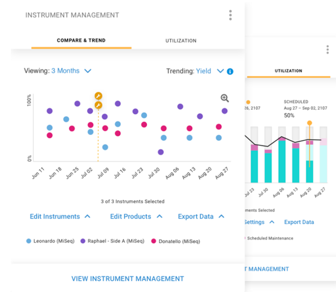
There was an expressed interest in tracking and managing instruments in the lab utilizing the BaseSpace ecosystem. I decided to work with two other teams, MyIllumina and Proactive) to implement some of their functionality in our tests.

MyIllumina Lab Overview Calendar

MyIllumina Instrument Charts
Since our user group included both lab managers and lab technicians, I tested higher level instrument information focused on run metrics. My focus was the ability for users to drill down from high level to individual run information without overloading users with unnecessary information. This was our first opportunity to start applying the new design system colors to the product.


Mid-fidelity test screens
Users appreciated the high-level info, especially the run progress bar, but disliked the color gradient. Based on this, we recommended reducing the gradient in the banner, focusing on consistent visuals with the NovaSeq instrument views.


BaseSpace Final Homepage Design
Based on feedback, the team decided to integrate MyIllumina graphs into BaseSpace for a more complete lab management tool. Due to some technical and engineering constraints our initial release focused on allowing users to view both instrument and run health on the chart and easily access key run data by clicking into each run.
Highlights
Working across multiple product updates brought its own challenges as their were a variety of competing interests. It was an invaluable opportunity to revisit a product workflow that I was intimately familiar with and look to optimize at a variety of stages. While I don't necessarily believe we ended up with the perfect final product, I believe we were able to make a product that improved immensely on the industry standard. I was very happy to see my explorations and implementation of charts and metric concepts received well, even when users were critical of other aspects of the platform.

Learnings
Having to speak with a variety of product owners and help onboard an external design team unfamiliar with the product area had it's challenges, and I believe I could have done more to help with them understanding the ecosystem better. If I was able to show how a day to day flow integrated with the various products and lab needs, the team may have been more receptive to the focus on higher level chart and metric information. I believe our final product definitely addresses the user needs, but I believe we may have left some opportunities on the table with some of our decisions.